FYI: If you're viewing this page, the popover API is currently only supported by the latest Chrome/Edge builds(and Safari's beta).
Firefox users need to go to their about:config and enable dom.element.popover (as of the time of writing)
This took a lot of trial and error, but this is pretty cool, I'll explain how new HTML popover works, how you can introduce it inline, and what it's capable of.
Before I go any further, I'm going to list my sources cited/used to get this JavaScript voodoo magic working:
There's a multitude of ways to use popovers, and just as many useful reasons why you should where possible. You can give users quick tool-tips for descriptions or
popover
noun
a puffed muffin with a hollow center, made with a batter of flour, salt, egg, and milk.
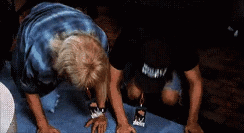
you can also use it for images, GIFs and
By default the popover attribute can be introduced by just using something as simple as:
<button popovertarget="popover2"> Open me </button>

<div id="popover2" popover>
  <p>I AM A POPOVER.</p>
</div>
I AM A POPOVER.
But when implementing popovers into a site that you've been working on for months or years or just use a custom theme with 99% of the CSS/JS setup for you already.
The following script and CSS may not work for you, but it may give some guidance to Ghost/WordPress/CMS user's who are wondering why their popover is appearing at the bottom right of the page and won't close or stays behind the <body> text after closing.
So, in the GIF above(the "thank you" popover) the HTML is basic:
I had to introduce the class="popover" because for whatever reason different image sizes would appear at different locations, plus it made styling the rest of the popover boxes a non-issue. So for the CSS I have:
Because I wanted to be able to use something that looks like plaintext and the position=relative both for the button and outer element to make sure the positioned popover children would show up where they were supposed to.
Lastly the JS, which may have been overkill but I was running into issues that gave me other issues and ended up with:
<script>
document.querySelectorAll('button[popovertarget]').forEach(button => {
  button.addEventListener('click', function(event) {
    // Prevent the click event from reaching the document
	event.stopPropagation();

    // Hide all other popovers
    document.querySelectorAll('.popover').forEach(pop => {
      pop.style.display = 'none';
    });

    // Show the clicked popover
    const popoverId = this.getAttribute('popovertarget');
    const popover = document.querySelector('#' + popoverId);
    const rect = this.getBoundingClientRect();
    popover.style.left = (rect.left + window.scrollX + rect.width / 2) + 'px';
    popover.style.top = (rect.top + window.scrollY - popover.offsetHeight) + 'px';
    popover.style.display = 'block'; // Show the popover
  });
});

// Hide popovers when clicking outside
document.addEventListener('click', function() {
  document.querySelectorAll('.popover').forEach(pop => {
    pop.style.display = 'none';
  });
});

// Hide popovers when pressing the Esc key
document.addEventListener('keydown', function(event) {
  if (event.key === 'Escape') {
    document.querySelectorAll('.popover').forEach(pop => {
      pop.style.display = 'none';
    });
  }
});


</script>
Your results may vary, while popover="auto" is supposed to take care of closing when clicking outside or pressing the ESC key, before I introduced this logic, when clicking outside of the popover the image would remain, but behind the body of the rest of the text. The most important part is the positioning.
Calculating the Left Position: popover.style.left = (rect.left + window.scrollX + rect.width / 2) + 'px';
This line calculates the left position of the popover. It takes the left position of the button (rect.left), adds the current horizontal scroll position (window.scrollX), and then adds half the width of the button (rect.width / 2). This ensures that the popover is horizontally centered over the button.
Calculating the Top Position popover.style.top = (rect.top + window.scrollY - popover.offsetHeight) + 'px';
Here we take the top position of the button (rect.top), add the current vertical scroll position (window.scrollY), and then subtracts the height of the popover (popover.offsetHeight) so that the popover shows up just above the button.
Together, these lines of code ensure that the popover is positioned directly above the clicked button, taking into account the current scroll position and the size of both the button and the popover. It provides a dynamic way to position the popover accurately, regardless of where the button is located on the page.
Hopefully this proves useful to anyone who uses a pre-built theme, CMS or otherwise. This isn't a proven cure-all, it's just something that happened to work for me. If this helped you or you still have issues, leave a comment below, I'm interested to see how others are using popovers.